I don’t know about you, but sometimes getting a new report from an analyst feels to me like an exciting holiday morning—or like unboxing an Apple product.
You had a burning question, you asked it well, and anticipated all of the “why do you want to know?” follow-ups to help speed things along. Now, you’ve got the answers.
The charts answer your questions perfectly. But, like always, the analysis inspires more questions. And, you know the analysts have more important things to do!
Now, before going back to the analyst to ask your next big game-changing question, you can answer more of the simple stuff on your own—right in the Mode report they've shared with you. Here's how it works.
Expand Your View, and Drill In
Open up your favorite dashboard, head to a chart, and click the rocket ship.
🚀
You'll get a bigger view of the chart, plus a whole slew of drag-and-drop controls. Everything you do in here will be for your exploration only—there's no need to worry about “breaking” the report, or changing it for everyone else who comes back to the report later. (If you do intend to edit the chart for everyone else, use “Edit” in the Report's navigation.)
Let's dive in.
First things first: if you're looking at a chart of time-based data, you'll see two controls in the bottom left corner of the chart. You can use these buttons to increase or decrease the granularity of the chart, within the bounds of the underlying data.

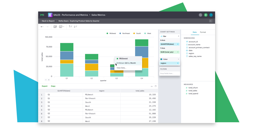
Use the dimension fields to change your view. Rather than looking at the data by month, maybe you want to check out which region has the strongest sales. Drag the Region dimension into the X-Axis. Then use the sort button in the tool bar to get your answer quickly.

As you explore, the data set below the chart updates to reflect the chart's data. For example, if you decrease the granularity from weekly to monthly data, the data table will also recalculate and display monthly totals. This makes it quick and easy to prep the right data set before copying or exporting it.
Let's say you want to look at a specific data point — you're curious what drove the increased sales in the West region.

Click on that data point to drill into that month's data, where you'll see that there was one epic week early in the month.

You can click the back arrow at any point to retrace your steps. You can also use the toolbar controls to jump all the way back to the beginning of your exploration if needed. To get a full view of the data behind a specific point, click on the data point, and then click “View Data.”
When you've explored the data set and found the answers you were looking for, simply click “Back to Report.” The dashboard will return to it's default settings.
Exploring Further
Interested in tips and tricks for getting even more out of your Mode report explorations? Join us for an upcoming webinar on February 13th where we'll walk you through the ins-and-outs of exploring data visually in Mode.


