


Since its introduction in 2007, ggplot2 has become one of the most frequently-downloaded and widely-used R packages in the world. Many people—including its creator, Hadley Wickham—attribute this success to the philosophy behind ggplot2.
The package was inspired by The Grammar of Graphics, Leland Wilkinson's seminal text about data viz, which breaks graphs up into semantic components like scales and layers, and separates data from presentation.
If you're one of the world's many fans of ggplot2, you may at times find yourself looking for additional bells and whistles to extend its functionality. Lucky for you, the R community has been hard at work building extension packages for ggplot2 over the past 10 years. Today, We're featuring 12 of our favorite ggplot2 extensions, to help you add more power and polish to your ggplots—or just to make them easier to create.
Read on for our reviews, including plenty of sample R Notebooks that will let you take these packages for a spin right inside your browser.
- gganimate
- ggdendro
- ggthemes
- ggpubr
- Plotly
- patchwork
- ggridges
- ggmap
- ggrepel
- ggradar
- ggcorrplot
- GGally
- ggiraph
gganimate
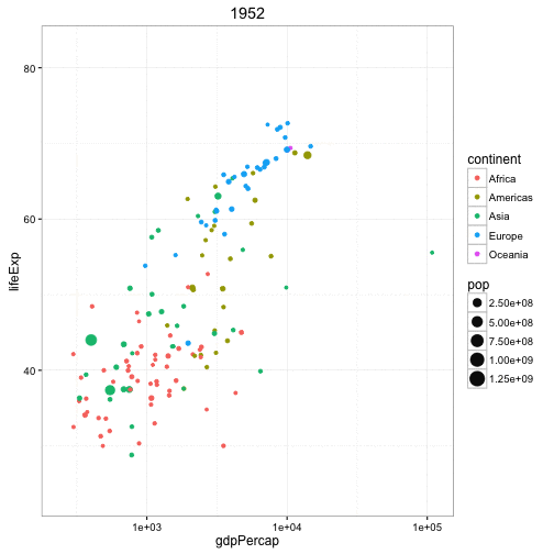
Animation of per-capita GDP over time from Gapminder data (David Robinson)
Love your ggplot visualization but wish it had more moving parts? gganimate can help with that. This extension package animates ggplot2 visualizations, treating the “frame” (that is, the time point in an animation) as an aesthetic in the same way that ggplot2 treats x, y, color, etc. The result is an animation built from various frames of the same plot.
As you can see in the example above, gganimate plots keep the axis limits and legends fixed, so that only the points move—keeping the viewer's attention focused on how the data changes over time. This also means that, unlike the animation package (where you create several plots and combine them), with gganimate you only need to build the plot— including the axes and legend—once.
gganimate also lets you save the animation to a file, such as an GIF, video, or an animated webpage, for use outside of RStudio or a Notebook.
Created by: David Robinson
Where to learn more: gganimate
ggdendro
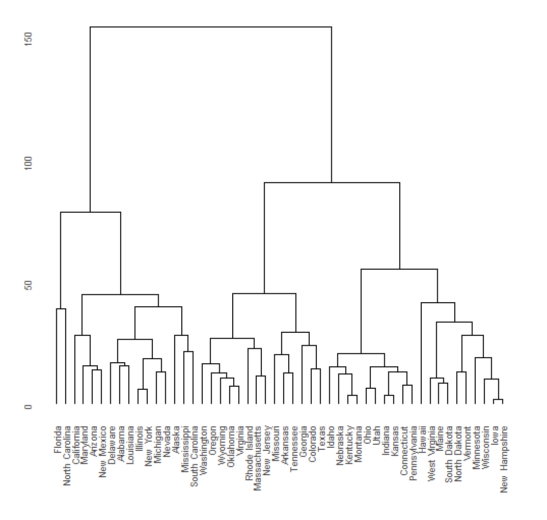
Cluster analysis of arrests by US state (Andrie de Vries)
If you're looking to control the appearance and display of your cluster analyses, make ggdendro your starting point. While base R does have a function for clustering, it only lets you plot dendrograms directly, and can't separate out or expose the underlying data. The ggplot2 philosophy instead aims to separate data from presentation, to give you greater control over how your data is displayed.
ggdendro offers a solution. It's got several useful functions to extract dendrogram plot data, so you can save or manipulate the data itself. Rotate your dendrogram, remove the grid background (as in the example above), reverse the scales, draw triangular line segments, create diana and agnes cluster diagrams, and more. Combine it with dendextend and ape for complete control over your dendrograms.
Created by: Andrie de Vries, available in Mode
Where to learn more: ggdendro
ggthemes
Motor Trend car dataset, “Highcharts” theme (Asha Hill)
If you want to lend your analyses a veneer of truthiness, check out ggthemes. This versatile package contains themes and scales that let you replicate the look of work by data viz giants from Edward Tufte to Fivethirtyeight, The Economist, The Wall Street Journal, Highcharts JS, and more.
There are even a few satirical inclusions, such as the Excel 2003 theme, which lets you replicate that “classic ugly look and feel” (with the note: “please never use this theme”).
Created by: Jeffrey B. Arnold, available in Mode
Where to learn more: ggthemes
ggpubr
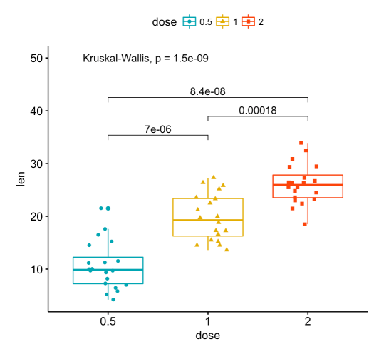
Box-and-whisker plots with comparative p-values (Alboukadel Kassambara)
ggplot2 is flexible and powerful, but not always user-friendly for those without serious R chops. And since lots of research publications require R charts, researchers who don't normally use R often need to produce highly-customized R charts on demand. That's why ggpubr exists: to make it easy to produce publication-ready plots using ggplot2 (even if you don't already know how to use ggplot2).
ggpubr is essentially a wrapper that uses more intuitive syntax to help beginning R coders produce sophisticated plots. The package lets you add p-values and significance levels to charts and arrange or annotate multiple plots on the same page. It also makes it easy to change formatting elements like colors and labels.
Created by: Alboukadel Kassambara, available in Mode
Where to learn more: ggpubr
patchwork
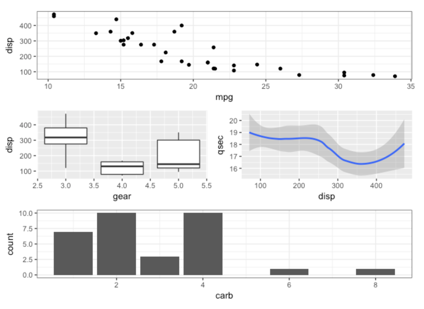
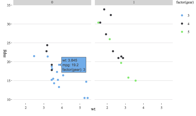
Patchwork grid plot of Motor trend car data (Thomas Pedersen)
How can you arrange multiple R plots in the same Notebook? For tiling multivariate data, packages like Lattice have you covered. But when you need to deal with several related plots, patchwork is the better choice.
This aptly-named package provides simple-to-use mathematical operators for combining and arranging multiple plots in a single space. To put plots next to one another, just use the + operator. To put plots on top of one another, use / for a vertical layout. And all of Patchwork's operators can be combined into a highly-readable layout syntax.
Created by: Thomas Pedersen
Where to learn more: patchwork
ggridges
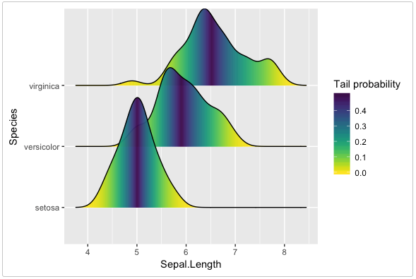
Ridgeline plot of iris dataset with colors showing tail distribution probability (Claus O. Wilke)
Ridgeline plots are partially overlapping line plots that get their name from their resemblance to a mountain range. (Heyo Joy Division.) They're especially useful for visualizing changes in distributions over time, space, or another continuous variable.
Since ridgeline plots are relatively new, ggplot2 has no native way of creating them. ggridges was created to fill the void. The package includes methods for calculating and plotting density estimates, for varying fill colors along the x-axis, and for calculating and visualizing various distribution statistics (like adding quantile info). You can also include the original data points from which the distributions are generated with various options for including and positioning jittered points, from “raincloud” to “rug” effects.
Created by: Claus O. Wilke, available in Mode
Where to learn more: ggridges
ggmap
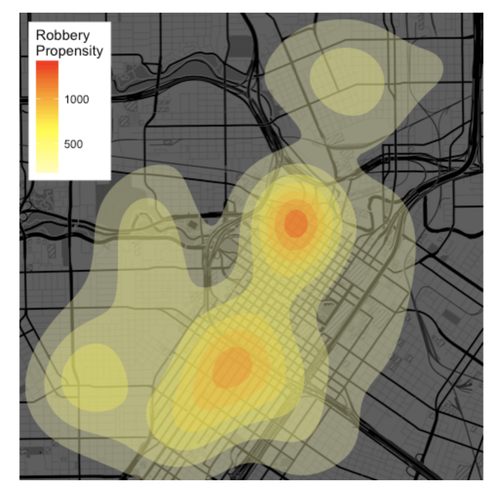
Density map of crime in Houston, TX made in ggmap (David Kahle)
ggmap is a powerful package for visualizing spatial data and models. It layers data on top of static maps from popular online sources like Google Maps, OpenStreetMap, and Stamen Maps.
What's great about ggmap is that it makes all of ggplot2's geoms available for map visualizations. That means you can make a contour plot or scatterplot on a map, or facet data over several maps. And you can create all these ggplot visualizations on top of lots of different styles of Google or Stamen maps, from satellite to roadmap—all of which gives you maximum flexibility in dealing with spatial data.
Created by: David Kahle
Where to learn more: ggmap
ggrepel
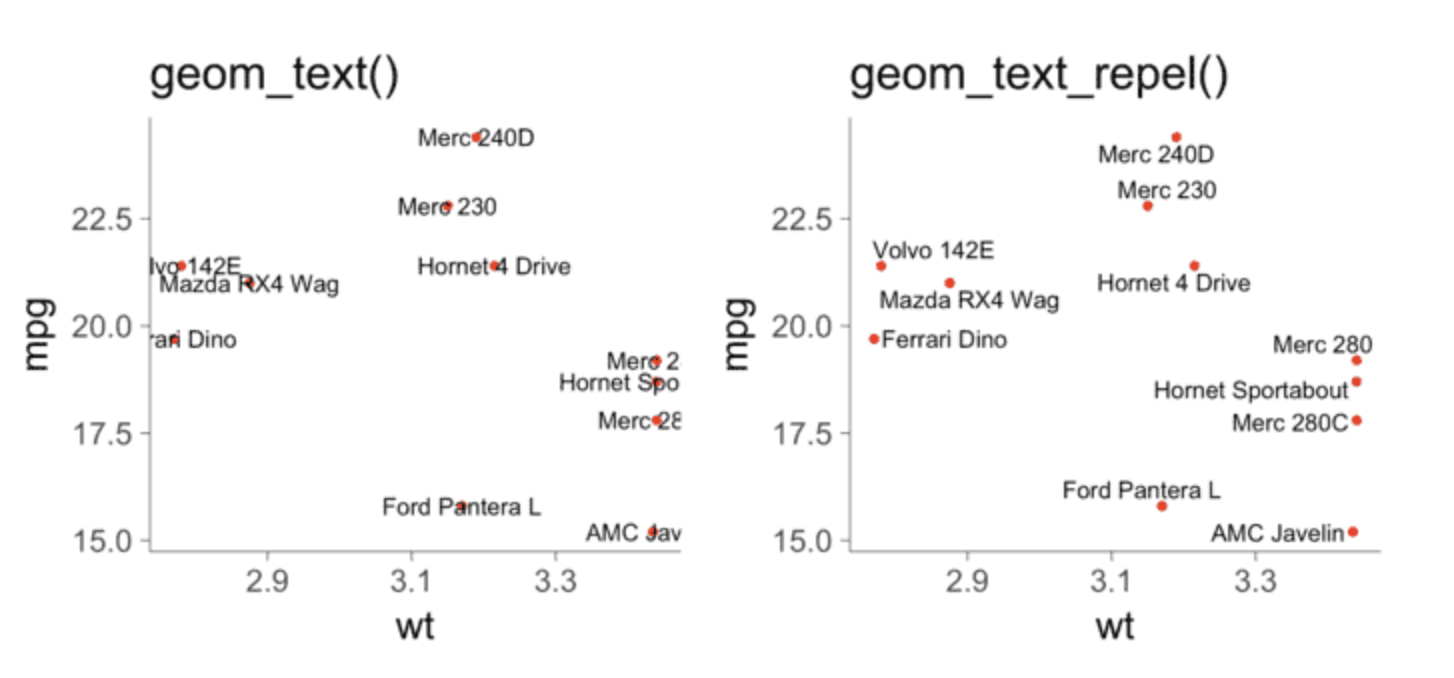
Comparison of geom_text() and geom_text_repel() labeling (Kamil Slowikowski)
ggrepel has a single—but extremely useful—purpose: to give ggplot2 users greater control over how text labels appear in their charts. As any R coder knows, the default handling of text labels in ggplot2 is sometimes less than ideal. (Just take a look at the chart on the left above.)
ggrepel fixes this, by providing text and label geoms for ggplot that will help you avoid various kinds of unsightly labeling. You can set the labels to simply repel away from one another, from data points, or from the edges of the plot. Or, you can selectively hide labels, limit them to a certain area of the plot, or justify them to align with an edge. May the force (of repellence) be with you.
Created by: Kamil Slowikowski
Where to learn more: ggrepel
ggcorrplot
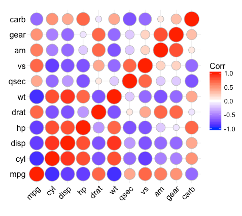
Circle correlation matrix of Motor Trend car dataset (Alboukadel Kassambara)
For fans of ggplot wanting to chart correlation matrices, ggcorrplot offers an elegant set of options. ggcorrplot was inspired by the corrplot package, but built to be used with ggplot methods. That means it's got lots of bells and whistles to let you control the appearance of your matrix, from altering the color, shape, or size of the boxes (as in the circle-matrix above), to adding coefficient labels, reordering the matrix according to hierarchical clustering, and so on.
Created by: Alboukadel Kassambara, available in Mode
Where to learn more: ggcorrplot
ggradar
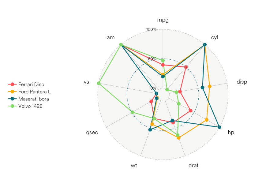
Radar chart of Motor Trend car dataset (Ricardo Bion)
Radar charts offer a useful way of visualizing multivariate data, revealing patterns and making it easy to draw comparisons. ggradar was designed to let you use the grammar of graphics to create these charts, also known as “spider charts” or “start charts.”
The package is based on Paul Williamson's code, which neatly solves for the unique specifications of this type of plot: circular gridlines combined with straight lines between plotted points, a radial axis, and so on. It's a package that should be on your radar. (Sorry not sorry.)
Created by: Ricardo Bion
Where to learn more: ggradar
GGally
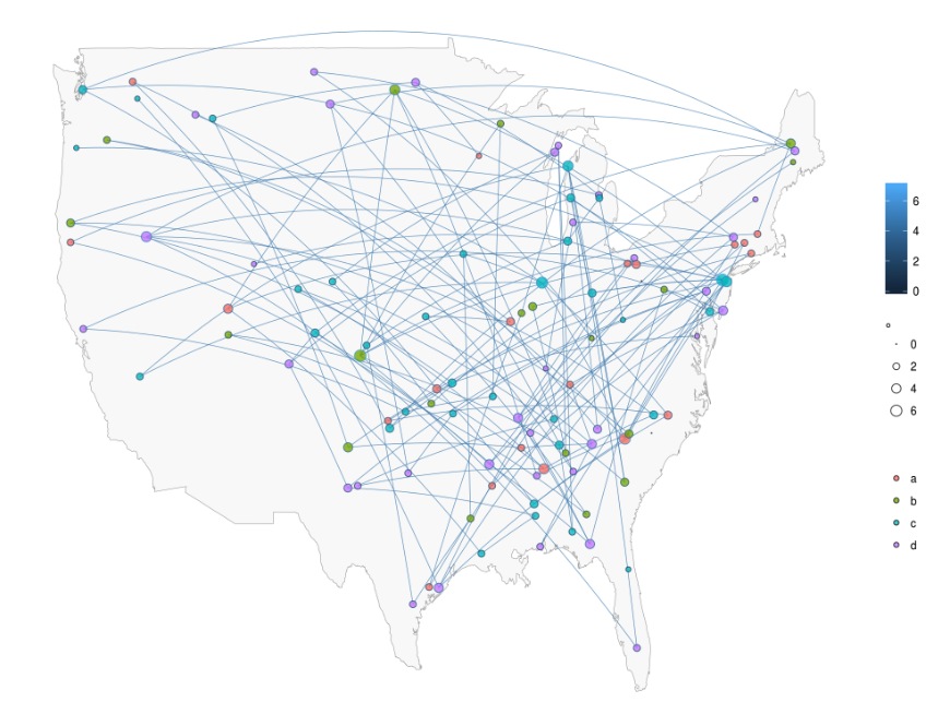
US flight patterns, network layered on a map using GGally (Amos Elberg)
GGally is an extension of ggplot2 that brings together a whole slew of useful additional visualization functionality, all in one package. You can use GGally to quickly plot the coefficients of a model or to draw networks over maps, as in the visualization above. Or maybe you need to rearrange your data to construct a glyph plot? You can use GGally for that, too.
GGally's ggsurv function is especially useful, because it lets you produce Kaplan-Meier plots using ggplot2. Combine it with the survival package, as we've done in this sample Notebook, and you've got a neat way to build models to analyze customer lifetime value and predict churn.
Created by: Barret Schloerke, available in Mode
Where to learn more: GGally
ggiraph
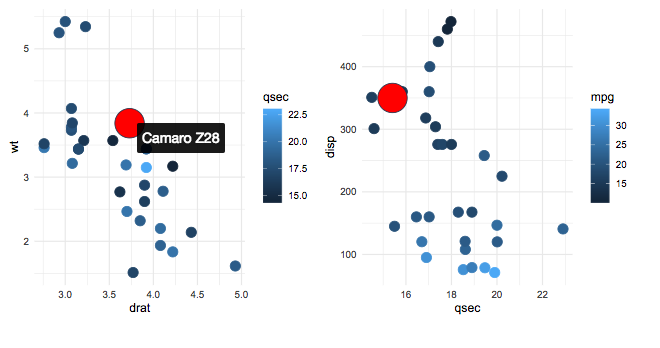
Interactive plot of Motor Trend car dataset with hover effect using ggiraph and patchwork (David Gohel
If you're looking to add advanced interactions or animations to your ggplots, ggiraph is your friend. With this htmlwidget, you can extend an existing ggplot2 bar chart, scatterplot, boxplot, map, etc., and do things like displaying a tooltip of your choice--say, data values or labels— on hover, or adding hover animations, as in the chart above.
You can also leverage ggiraph to perform a specific action when a viewer clicks on an element in your chart, like opening a new page. Just specify a Javascript function for the action and ggiraph does the rest.
Created by: David Gohel
Where to learn more: ggiraph
If we’ve missed any of your favorite ggplot2 extension packages in this short list, let us know! Tweet at us @ModeAnalytics. Or, email us: hi@modeanlaytics.com. We love hearing from you.

