12 Python Data Visualization Libraries to Explore for Business Analysis
Melissa Bierly, Content Marketing
October 22, 2021•Updated on May 17, 2022
NaN minute read
This piece has been updated by our Technical Content Writer, Chioma Dunkley.
Oct. '22 update: Python 3.9 and new libraries have been added to the standard notebook environment.
Scroll through the Python Package Index and you'll find libraries for practically every data visualization need—from GazeParser for eye movement research to pastalog for realtime visualizations of neural network training. And while many of these libraries are intensely focused on accomplishing a specific task, some can be used no matter what your field.
This list is an overview of 12 interdisciplinary Python data visualization libraries, from the well-known to the obscure. Mode Python Notebooks support five libraries on this list - matplotlib, Seaborn, Plotly, pygal, and Folium - and more than 60 others that you can explore on our Notebook support page.
We hope these lists inspire you, and if you want to add a library that's not listed, use our instructions to install additional libraries or send a note to success [at] modeanalytics [dot com].

Mode's Live Weekly Demo
Join our group demo to get a communal walk-through of Mode!
matplotlib
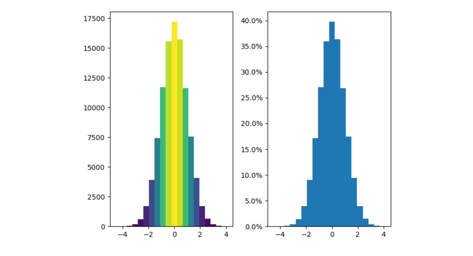
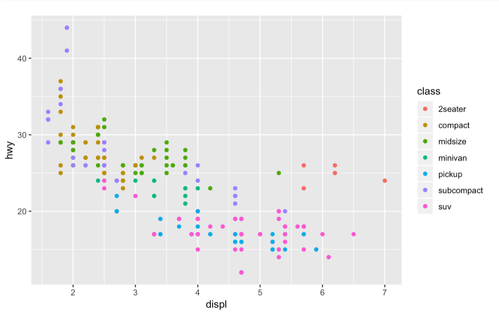
Two histograms (matplotlib)
matplotlib is the O.G. of Python data visualization libraries. Despite being over a decade old, it's still the most widely used library for plotting in the Python community. It was designed to closely resemble MATLAB, a proprietary programming language developed in the 1980s.
Because matplotlib was the first Python data visualization library, many other libraries are built on top of it or designed to work in tandem with it during analysis. Some libraries like pandas and Seaborn are “wrappers” over matplotlib. They allow you to access a number of matplotlib’s methods with less code.
While matplotlib is good for getting a sense of the data, it's not very
useful for creating publication-quality charts quickly and easily. As Chris Moffitt points out in his overview of Python visualization tools, matplotlib “is extremely powerful but with that power comes complexity.”
matplotlib has long been criticized for its default styles, which have a distinct 1990s feel. Its current release of matplotlib 3.5.3 still reflects this style.
Created by: John D. Hunter, available in Mode Where to learn more: matplotlib.org
Want to brush up on your Python skills? Check out our tutorial to learn how to analyze and visualize data using Python.
Seaborn

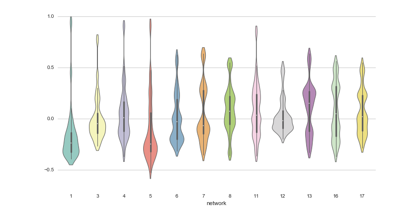
Violinplot (Michael Waskom)
Seaborn harnesses the power of matplotlib to create beautiful charts in a few lines of code. The key difference is Seaborn's default styles and color palettes, which are designed to be more aesthetically pleasing and modern. Since Seaborn is built on top of matplotlib, you'll need to know matplotlib to tweak Seaborn's defaults.
Created by: Michael Waskom, available in Mode Where to learn more: http://web.stanford.edu/~mwaskom/software/seaborn/index.html
Plotnine (ggplot2)
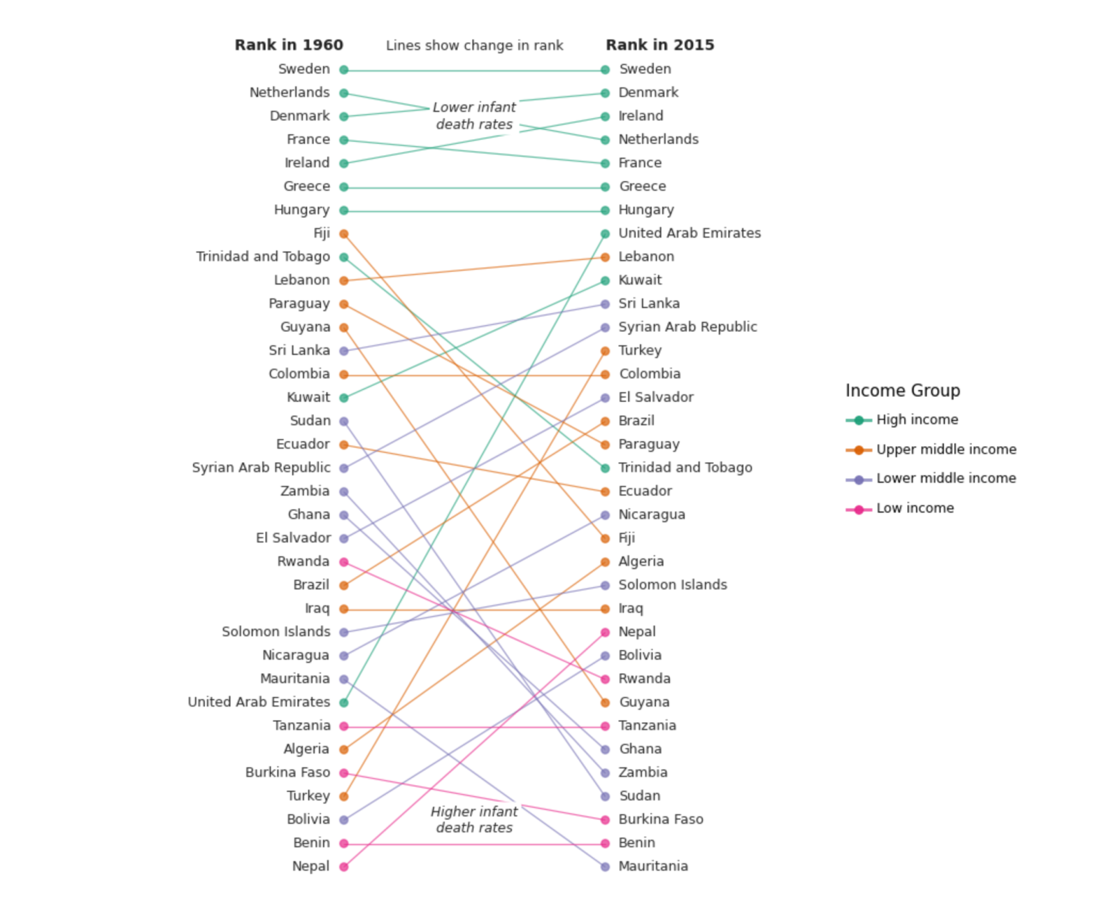
Change in Rank (Plotnine)
Plotnine is a python implementation of ggplot2, an R plotting system, and concepts from The Grammar of Graphics. It's a powerful visualization package that you layer components to create a complete plot. For instance, you can start with axes, then add points, then a line, a trendline, etc. As a functional port of ggplot2, R programmers familiar with ggplot2 will find Plotnine easy to transition to.
Plotnine is tightly integrated with pandas, so it's best to store your data in a DataFrame when using Plotnine.
Created by: Hassan Kibirige (Check out his interview with us.) Where to learn more: https://plotnine.readthedocs.io/en/stable/index.html
Bokeh
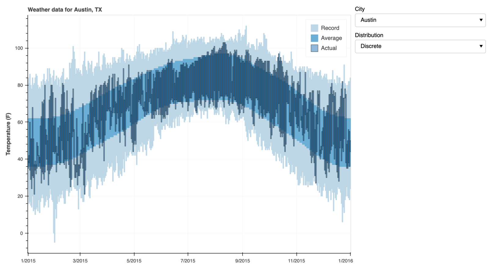
Interactive weather statistics for three cities (Bokeh)
Like ggplot, Bokeh is based on The Grammar of Graphics, but unlike ggplot, it's native to Python, not ported over from R. Its strength lies in the ability to create interactive, web-ready plots, which can be easily output as JSON objects, HTML documents, or interactive web applications. Bokeh also supports streaming and real-time data.
Bokeh provides three interfaces with varying levels of control to accommodate different user types. The highest level is for creating charts quickly. It includes methods for creating common charts such as bar plots, box plots, and histograms. The middle level has the same specificity as matplotlib and allows you to control the basic building blocks of each chart (the dots in a scatter plot, for example). The lowest level is geared toward developers and software engineers. It has no pre-set defaults and requires you to define every element of the chart.
Created by: Anaconda Where to learn more: http://bokeh.pydata.org/en/latest/
Want to brush up on your Python skills? Check out our tutorial to learn how to analyze and visualize data using Python.
pygal
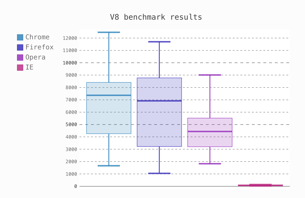
Box plot (Florian Mounier)
Like Bokeh and Plotly, pygal offers interactive plots that can be embedded in the web browser. Its prime differentiator is the ability to output charts as SVGs. As long as you're working with smaller datasets, SVGs will do you just fine. But if you're making charts with hundreds of thousands of data points, they'll have trouble rendering and become sluggish.
Since each chart type is packaged into a method and the built-in styles are pretty, it's easy to create a nice-looking chart in a few lines of code.
Created by: Florian Mounier Where to learn more: http://www.pygal.org/en/latest/index.html
Learn more
See the Visualizations you can create in Mode
Learn about Visual Explorer
Plotly
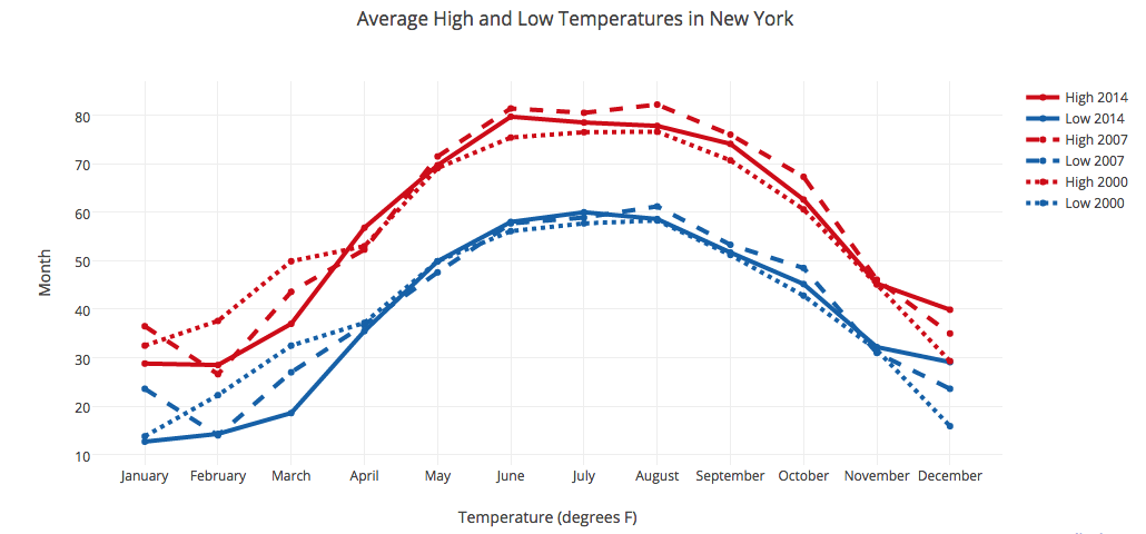
Line plot (Plotly)
You might know Plotly as one of the best data visualization tools, but did you also know you can access its capabilities from a Python notebook? Like Bokeh, Plotly's forte is making interactive plots, but it offers some charts you won't find in most libraries, like contour plots, dendrograms, and 3D charts.
Created by: Plotly, available in Mode Where to learn more: https://plot.ly/python/
geoplotlib
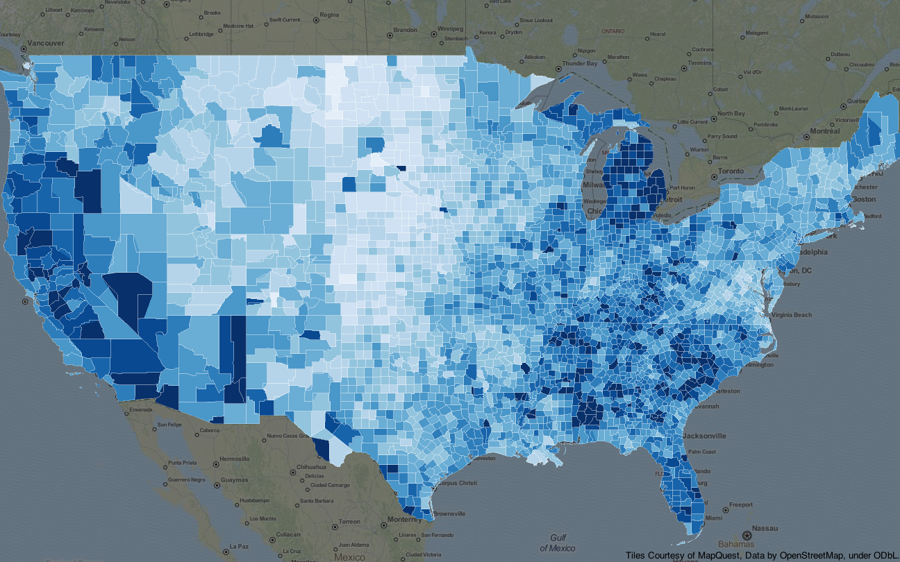
Choropleth (Andrea Cuttone)
geoplotlib is a toolbox for creating maps and plotting geographical data. You can use it to create a variety of map-types, like choropleths, heatmaps, and dot density maps. You must have Pyglet (an object-oriented programming interface) installed to use geoplotlib. Nonetheless, since most Python data visualization libraries don't offer maps, it's nice to have a library dedicated solely to them.
Created by: Andrea Cuttone Where to learn more: https://github.com/andrea-cuttone/geoplotlib
Gleam
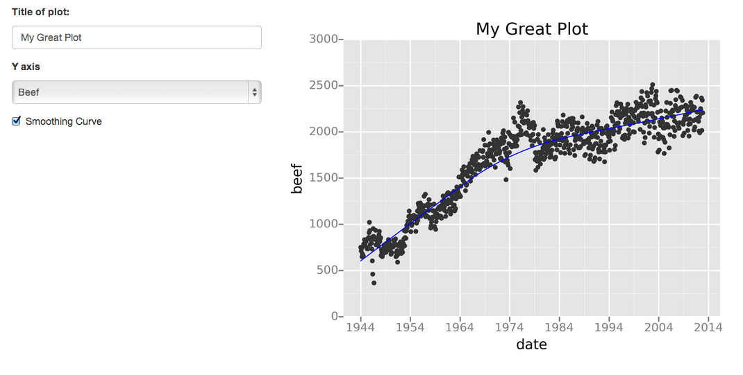
Scatter plot with trend line (David Robinson)
Gleam is inspired by R's Shiny package. It allows you to turn analyses into interactive web apps using only Python scripts, so you don't have to know any other languages like HTML, CSS, or JavaScript. Gleam works with any Python data visualization library. Once you've created a plot, you can build fields on top of it so users can filter and sort data.
Created by: David Robinson Where to learn more: https://github.com/dgrtwo/gleam
missingno
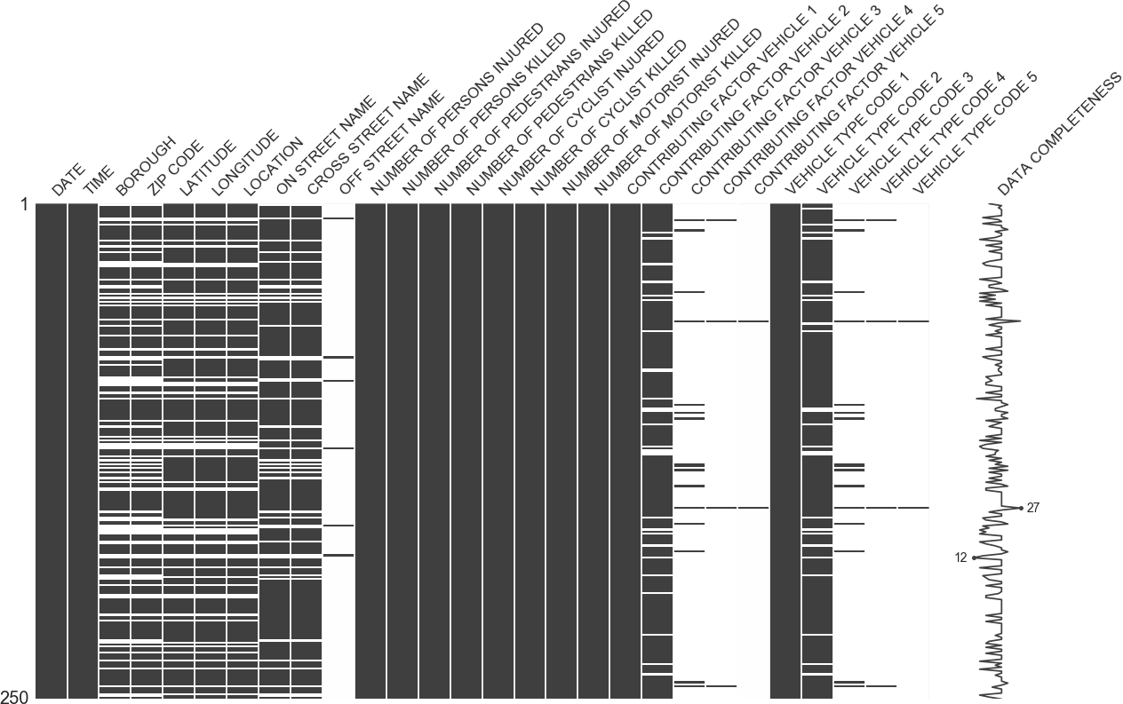
Nullity matrix (Aleksey Bilogur)
Dealing with missing data is a pain. missingno allows you to quickly gauge the completeness of a dataset with a visual summary, instead of trudging through a table. You can filter and sort data based on completion or spot correlations with a heatmap or a dendrogram.
Created by: Aleksey Bilogur Where to learn more: https://github.com/ResidentMario/missingno
Leather
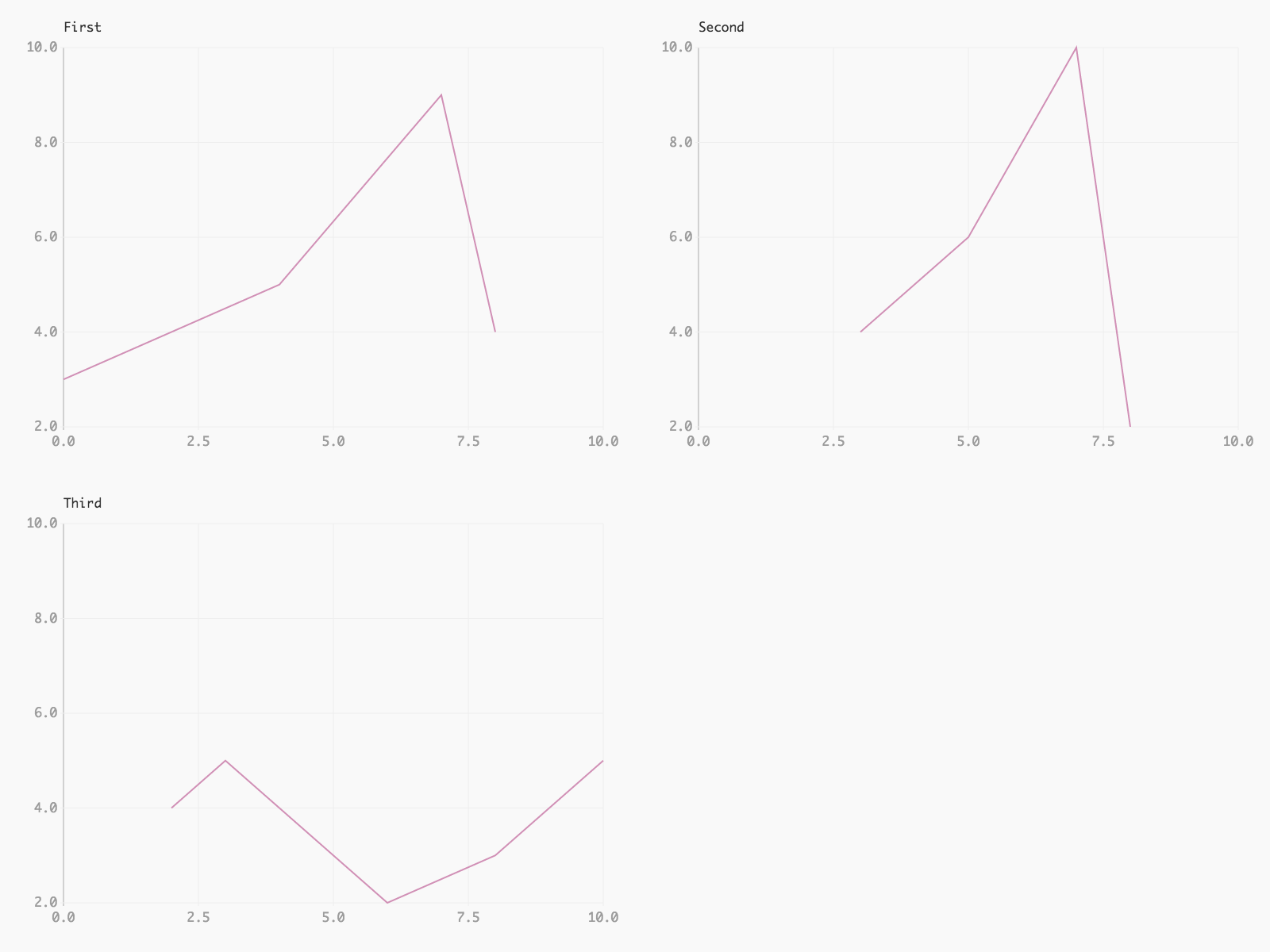
Chart grid with consistent scales (Christopher Groskopf)
Leather's creator, Christopher Groskopf, puts it best: “Leather is the Python charting library for those who need charts now and don’t care if they’re perfect.” It's designed to work with all data types and produces charts as SVGs, so you can scale them without losing image quality. Since this library is relatively new, some of the documentation is still in progress. The charts you can make are pretty basic—but that's the intention.
Created by: Christopher Groskopf Where to learn more: https://leather.readthedocs.io/en/latest/index.html
Altair
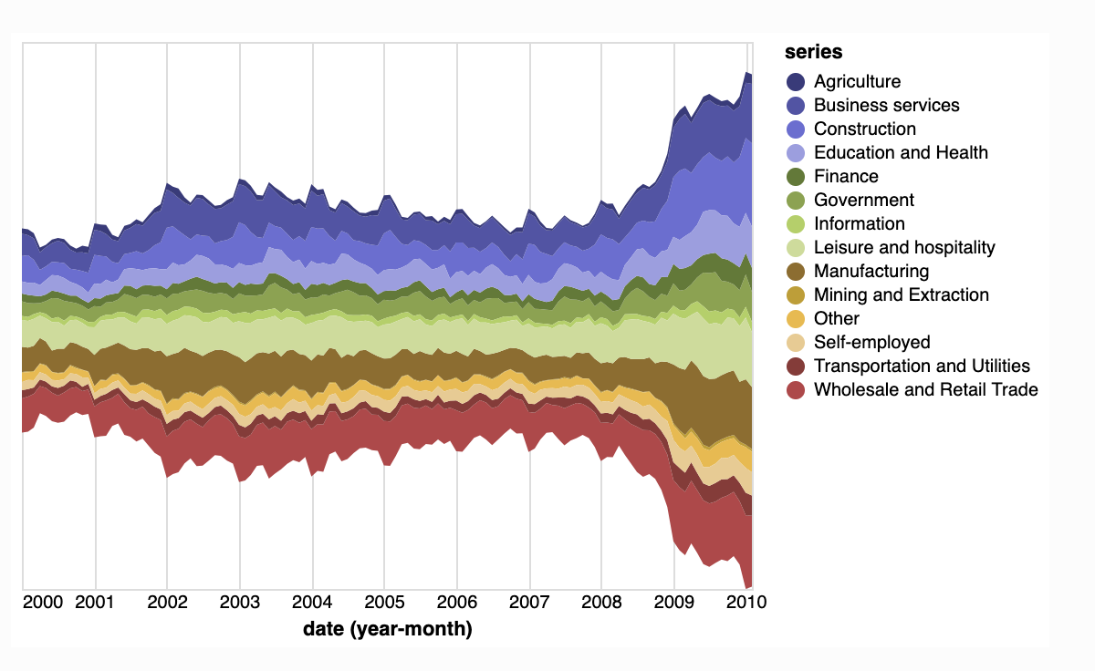
Steamgraph (Altair)
Like Seaborn, Altair is a declarative visualization library that allows you to create aesthetically pleasing graphs & charts; but unlike Seaborn which is based on Matplotlib, Atair is based on Vega and Vega-Lite. It is great for creating interactive visualizations easily and quickly. Its downsides are that it doesn’t look as nice as plotly or bokeh, and some users have mentioned experiencing difficulty when arranging its components.
Created by: Jake Vanderplas & Brian Granger
Where to learn more: https://altair-viz.github.io/index.html
Folium
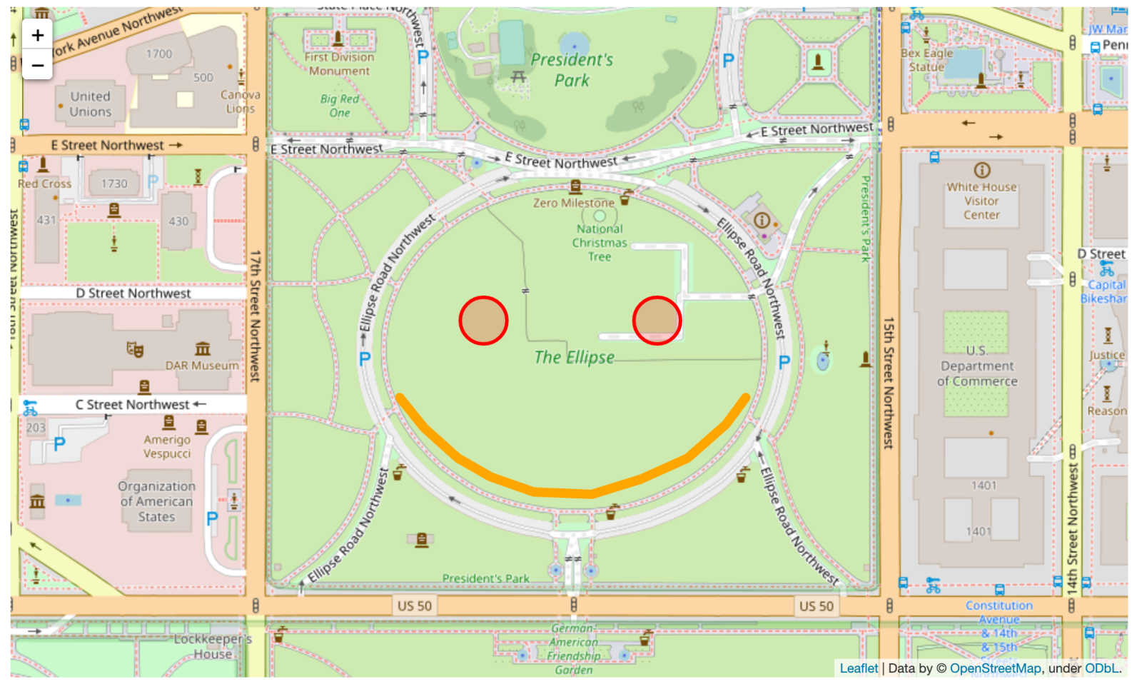
MultiPolyline (Folium)
Folium is an open-source library built on the data power of python and mapping capabilities of leaflet.js (a Javascript library). It allows you to visualize geospatial data. You can build a variety of interactive maps such as choropleth maps, scatter maps, bubble maps, heatmaps, etc. One powerful element of Folium are its various plugins like Markercluser, ScrollZoomToggler, DualMap that let you wrap leaflet maps and extend its functionality.
Created by: Folium
Where to learn more: https://github.com/python-visualization/folium
Other great reads on Python data visualization
There are a ton of great evaluations and overviews of Python data visualization libraries out there. Check out some of our favorites:
Overview of Python Visualization Tools (Practical Business Python)
Python data visualization: Comparing 7 tools (Dataquest.io)
No coding experience? No problem. Learn Python using real-world data with our free tutorial.
Recommended articles
Oct. '22 update: Python 3.9 and new libraries have been added to the standard notebook environment.
Learn more
Get a deeper dive of Mode's Visualizations
Learn how Mode's visualizations can help you tell stronger stories with your data.
Get our weekly data newsletter
Work-related distractions for data enthusiasts.
