


In our previous blog post, we covered some of the exploratory analysis we did for Highfive, a modern meeting room collaboration and video conferencing solution. We determined the right metric for measuring customer engagement: something we call “sustained call hours/device/day” (SCH/BD). It’s a moving average of the hours of Highfive usage per day normalized by the number of Highfive devices.
By analyzing Highfive’s data, we found that a customer who is engaged within 100 days is much more likely to expand their use of Highfive and buy more devices in the future. In other words, they have a much higher lifetime value (LTV). So we set out to build a model that would predict long-term engagement. Using SCH/BD, we wanted to look 100 days into the future.
Building a model to predict customer engagement
Mathematically, our goal was to create a model that could do two things:
- Figure out which features were important for driving long-term customer engagement.
- Use those results to predict long-term customer engagement based on the features customers are using.
Fortunately, since Highfive started collecting data early on, we had almost two years of historical data to train on—so this was squarely a supervised learning problem. We initially contemplated creating a regression-based model to predict the continuous value of SCH/BD—but Highfive didn’t care too much about the exact value of SCH/BD. They cared about how customers with very low engagement differed from the customers with high engagement.
So we decided to use a trick we’ve often used in the initial model building phases—create a classifier to model the extreme ends of the distribution. By feeding the model a cleaner, more extreme dataset, we’re removing some of the noise so that the model can see the signal more clearly.
To this end, we removed customers with middling engagement (with 0.25 < SCH/BD < .75) from our data set. We then labeled the customers that had SCH/BD < 0.25 after 100 days as “long-term disengaged” (i.e. class 0) and the customer that had SCH/BD > 0.75 after 100 days as “long-term engaged” (i.e. class 1).
All of this was done in Mode using a combination of SQL and Python. We wrote a single query to select the SCH/BD for every company at 100 days. We then used Python to filter the data and do the final labelling to create our dependent variable vector, y. We stored this as a Pandas Series: the index was the company name, the values were 0 if “long-term disengaged” and 1 if “long-term engaged.”
Feature engineering leading indicators of engagement
Once we had our y, the next step was to figure out the exogenous variables, or features, of the model. We worked very closely with the Highfive executive team at this step. They already had a good idea of what some of the leading indicators of engagement could be. We just had to create these features from the raw BigQuery logs. Potential features included:
- Whether a customer had a free trial
- Number of conference rooms in company
- Time between when the sales closed to when the device was installed
- Number of unique users of devices in the first month
- Average rating for calls in the first month
- Percent of calls having problematic audio quality in the first month
- Number of dropped calls in the first month
Creating features, like these, from raw data is called “feature engineering” in the data science world. To create these features, we built out a complex SQL query with multiple subqueries and joins. With Mode all of our incremental query development was held in one report, so we didn’t have to cut and paste subqueries into random .txt files. That is particularly handy when you’re writing tons of 100+ line queries with five nested subqueries in each.
Once we had the features, we could switch over to Python to create plots for each feature that showed their probability density functions (PDFs) conditioned on each of the classes.
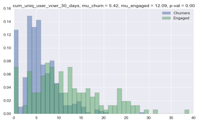
The plot below shows the conditional PDFs for one feature—the cumulative unique device users in the first month. We used the matplotlib library to make this graph. The blue PDF is for “long-term disengaged” customers. The green PDF is for the “long-term engaged” customers. We also computed the t-statistic between the two PDFs using SciPy. The PDFs and the p-value of the difference show that this feature is clearly useful for discriminating between the two classes.
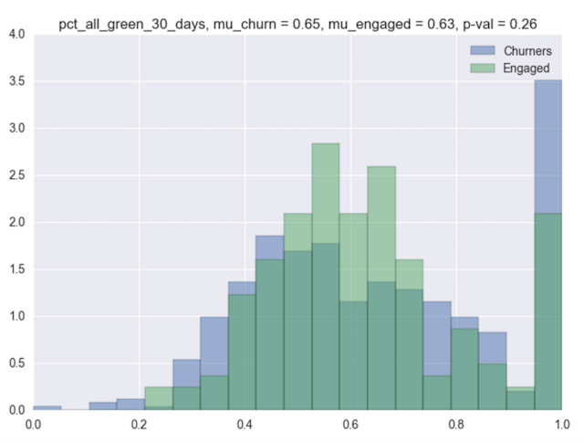
The next plot shows the conditional PDFs for another feature—the average call quality ratings in the first thirty days. The users of Highfive can rate a call with thumbs up (0) or thumbs down (1) after each call. We thought there may be a signal in this feature as well. But looking at this plot, it seems that this feature is not so discriminative. The conditional PDFs look almost the same and the p-value of the difference is very high.
Creating this plot and running the statistical analysis was simple in Python—and not possible in SQL. The beauty of Mode is that it brings this sort of analysis all together. I can make the feature using SQL and do the Python analysis in the same report. No need to have multiple tools and brittle connections set up between our database and Python. Everything is in one place—and synced up!
Training our predictive model
Once we were ready to train our predictive model, we created a new Mode report where we made a query for each feature (and one to create the output y). We stitched the features together into a big X matrix using pandas merge commands and then got to work trying different classification algorithms on our data.
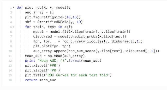
In different cells of our Notebook we tried logistic regression, support vector machines, and random forests. For testing, we wrote up a utility function to compute the out-of-sample performance using k-fold cross validation in one of the cells. It computed the area under the ROC curve (AUC) for the classifier and plotted the ROC curve for the various folds. Using scikit-learn made all of this very straightforward.
Early on it was apparent that the random forest was the only classifier worth looking at, so we chose that model. After that, our job became about computing and adding features to improve the accuracy of our model. This was a very iterative process:
- Fire up a feature engineering Mode report to develop a new feature, e.g. unique device users in first month.
- Perfect the feature in the feature engineering report by looking at plots like Figure X in Python, outliers, and other factors that affect data integrity.
- Copy the final feature creation query into a new Query in our modelling Report.
- Add the output of that query to our feature matrix, X, in the modelling Report Notebook.
- Rerun the random forest training and assess performance.
The first set of “simple” features that did not require complex SQL got us to an AUC of 0.72. This isn’t great in terms of classifier performance. It’s better than chance (AUC= 0.5), but not very strong. Consequently, we added more features to the model, like unique device users and audio quality. That drove our AUC to 0.87—a much stronger predictor of long-term engagement.
Before Python in Mode, we’d typically just export the features as CSV files and run Python on our own laptops. To collaborate, we’d send the CSV files to each other. Let me not mince words here: This was a terrible workflow. Passing around CSVs was a logistical nightmare because there were multiple versions of the file floating around. Since Mode supports SQL and Python, all of our feature creation SQL and Python modeling code is in one place that’s immediately amenable to collaboration.
The aha moment
Our final model was a random forest model with 18 features. Though all features mattered at some level, some of the key drivers were found to be the number of unique users and audio quality.
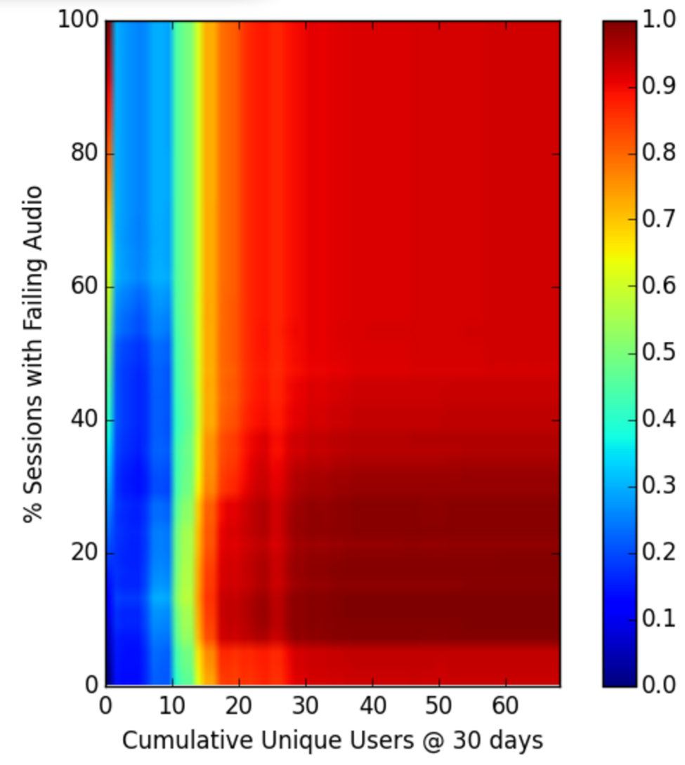
Going even further, we did a more tailored sensitivity analysis of the inputs to our model. We swept various features over a range and saw how much the class probability changes. For example, we swept unique users vs. audio quality to see which matters more.
The plot below shows unique users matters much more. If you don’t have over 10—no matter how good audio quality is—you have low probability of long-term engagement. As a communication product, the value is in the the number of people using the tool. Employees are more likely to use the product if it’s widely used across the company.
We did many more analyses to really get at what drives customer engagement. One very actionable insight we found is that getting 10 unique users (of any of the Highfive features) in first 10 days of use was very important to long term engagement. This result has become one of Highfive’s “aha moments”—they now work hard to get 10 unique users in the first 10 days (“10 in 10”). Another interesting result we found is that audio quality matters much more than video quality for engagement, but neither matters if you don’t have enough unique users.
The Highfive Customer Success and Product teams are now using these actionable insights to optimize their efforts. These are exciting times for serving customers better, by leveraging data rather than assumptions. With more customer data available than ever before, from more sources both internal and external, powerful predictive customer analytics are now within reach for many companies and teams. The challenge is to distill from this ocean of data, the actionable metric—the “10 in 10”—that's unique to a specific team and objective.

