


Analysis isn’t just about finding the insights—it’s about delivering them to your coworkers. And often the biggest challenge is helping recipients turn the insights into action. The smallest elements of a data visualization can be the difference between an engaging analysis and a snooze-fest.
Mode's HTML editor gives you the flexibility to change every element in your report—and deliver more engaging analysis that ever before. Since launching the Example Gallery in July, we've seen more and more analysts modifying reports to communicate clear data stories. Some analysts are making small tweaks to out-of-the-box charts—like using on-brand colors or adding an annotation to explain a trend; others are building completely custom visualizations no other business intelligence software can provide.
The Mode Example Gallery—and its accompanying JavaScript library, alamode.js—includes data visualization examples that just scratch the surface of what's possible in Mode. We're constantly making updates and adding to alamode.js based on conversations we have with other analysts (we get pretty excited when people make pull requests, too).
Today we bring you two big updates: fast-and-easy conditional formatting for your data tables, and a few different options for network visualizations.
Conditional formatting
Spreadsheet wizards will love this one. Learn how to add conditional formatting to the out-of-the-box data tables. You can shade cells based on values to quickly highlight outliers or trends.
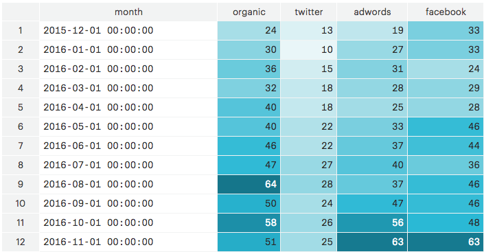
Click here to see this example in the Gallery.
Network visualizations
Network visualizations illustrate complex relationships between distinct objects (known as nodes). They've been used to examine communities on social media, illustrate the flow of global migration and debt, and explore the makeup of the U.S. wine industry. There are a few different kinds of network visualizations and the Example gallery features three of the most popular.
Network matrices make it easy to identify which nodes have strong connections and which have no connection at all. A messaging service could use this visualization to figure out who chats with whom. In fact, the dating site OKCupid employed a network matrix to show how someone's race affects the number of responses they receive.
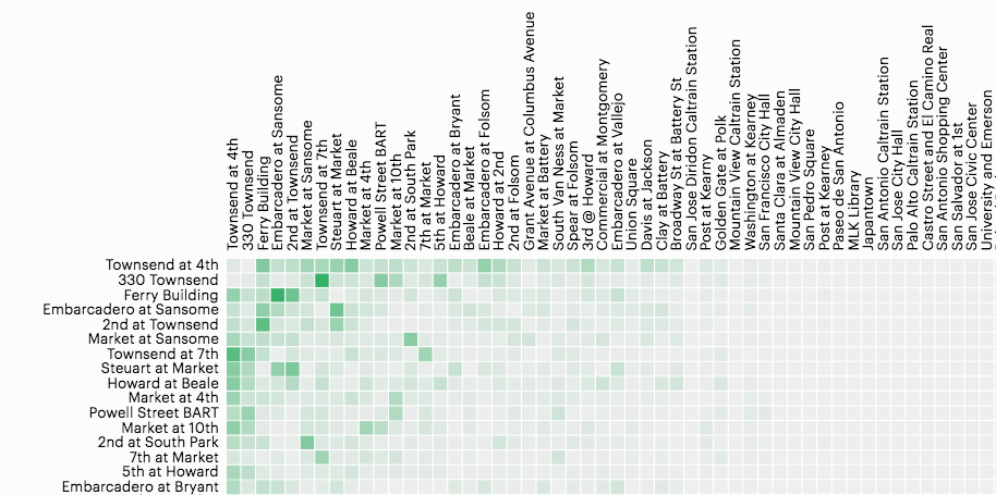
Click here to see this example in the Gallery.
Force-directed layouts are a good choice when you're exploring a dataset for the first time and want to get a high-level idea of how nodes are connected. These visualizations are often used to reveal the intricacies of social networks, but they can be applied to a variety of datasets. A manufacturing company could use a a force-directed layout to understand which of their products share the most components or an analyst could make one to discern which database tables are most important in their company's schema.
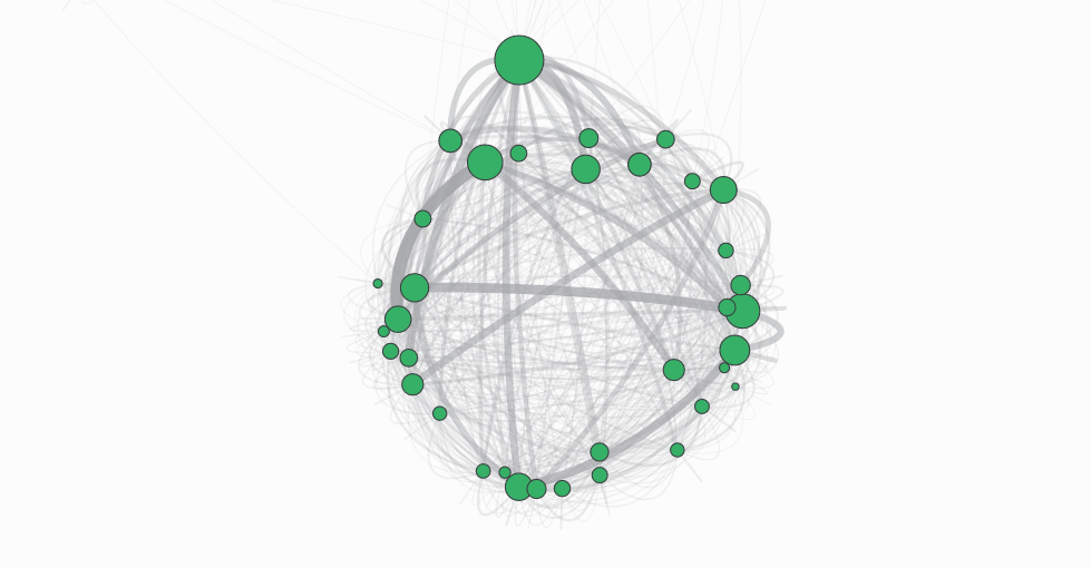
Click here to see this example in the Gallery.
Hive plots are suited for showing the structure of a network, especially one with a large number of connections. An engineer might use hive plot to map dependencies in their product's software library.
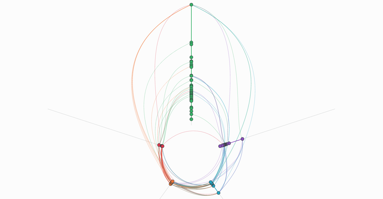
Click here to see this example in the Gallery.
Never coded before?
No problem. Every example in the Mode Example Gallery includes code snippets you can drop right into the HTML editor. They'll “just work.” From there you can start to tweak the code and customize elements even further. To get started, read this guide.
Can't find what you need?
Tell us! Or, if you're comfortable with JavaScript, consider contributing to alamode.js.
Lucky number 7
That was number seven of the 12 new features we're rolling out. Keep your eye on the blog for tomorrow's update!

