11 Data Visualization Experts Who Will Constantly Inspire You
Melissa Bierly, Content Marketing
June 28, 2016
NaN minute read
Learn more

See the Visualizations you can create in Mode
Learn about Visual Explorer
When writers hit a block, they read. When musicians get stuck, they seek stimulation by listening to music. It's the same with any craft. The more you surround yourself with the work of others in your field, the more opportunities you have to learn, be inspired, and channel those influences back into your own work.
For data visualization practitioners, that means looking at inspiring graphics and reading about the creative processes behind them. In other words—spending a lot of time on Twitter and data viz blogs.
Here's a list of data visualization leaders who contribute to the community on a daily basis.
Alberto Cairo @albertocairo
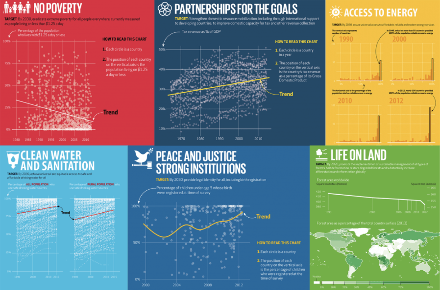
Alberto Cairo is the Knight Chair in Visual Journalism at the University of Miami's School of Communication and has written two books on data visualization: The Functional Art and The Truthful Art. He shares his favorite books, articles, and own thoughts regularly on his blog. It's a must-subscribe for anyone looking to surround themselves with data viz thought leadership.
Mona Chalabi @MonaChalabi
Embedded content: https://www.instagram.com/p/BrnTuCqHP4g/
Mona Chalabi is the Data Editor at The Guardian U.S., where she's covered topics such as gun control, sex, and gender politics. Her Instagram account is a real gem, full of data visualization sketches she's drawn to make data more accessible. (Heads up: some visualizations are NSFW.)
Andy Kirk @visualisingdata

Andy Kirk's site Visualising Data is a goldmine of information on the craft. He runs several series of posts:
The little of visualisation design: Each post focuses on “just one small matter—a singular good or bad design choice—as demonstrated by a sample project.”
Six questions with...: Kirk interviews data visualization professionals such as Kim Rees of Periscopic, Alyson Hurt of NPR, and Alan Smith of the Financial Times.
Best visualisations of the web: A monthly digest of best visualizations the net has to offer.
Consider also checking out Kirk's new book, Data Visualisation: A Handbook for Data Driven Design.
Robert Kosara @eagereyes
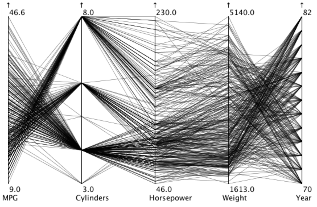
Robert Kosara has been blogging about data visualization for over a decade. He regularly writes about the psychology of data visualization—such as how rainbow-colored maps are misleading and how humans read pie charts—and comments on trends in the field.
He strives for the articles on his site “to be of value over a longer time period”—and, indeed, they are. The vast majority of his posts are as relevant today as the day they were published. For instance, if you feel strongly about pie charts, Kosara has a trove of articles on the subject:
Kosara has also written several research papers as a Senior Research Scientist at Tableau and a former associate professor. For those who want the TL;DR version, he usually summarizes his findings in an accessible, easy-to-read post.
Giorgia Lupi @giorgialupi
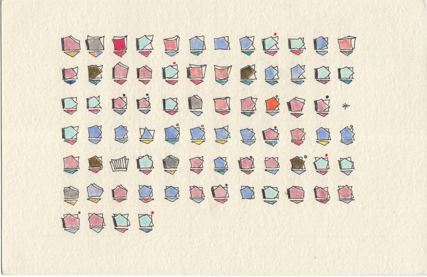
For those who reach for their pencil instead of their keyboard when they encounter a new dataset, Giorgia Lupi is your new hero. She's written and presented extensively on how sketching can define the structure and aesthetic of visualizations. Here are a couple of her projects and presentations that delve into drawing data:
The Shapes of My Thoughts: Lupi shares her personal sketching process and how she uses drawing as a design tool.
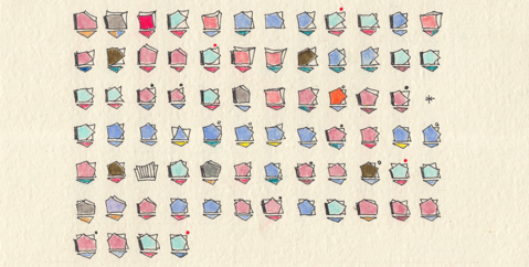
Dear Data: A year's worth of personal data, sketched on postcards, sent between Lupi and designer Stefanie Posavec as a way to get to know each other better.
David McCandless @infobeautiful

Data journalist and information designer David McCandless's Twitter is a steady stream of graphics from around the web. His site, which boasts tons of interactive charts, and his books are worth checking out as well.
Cole Nussbaumer @storywithdata
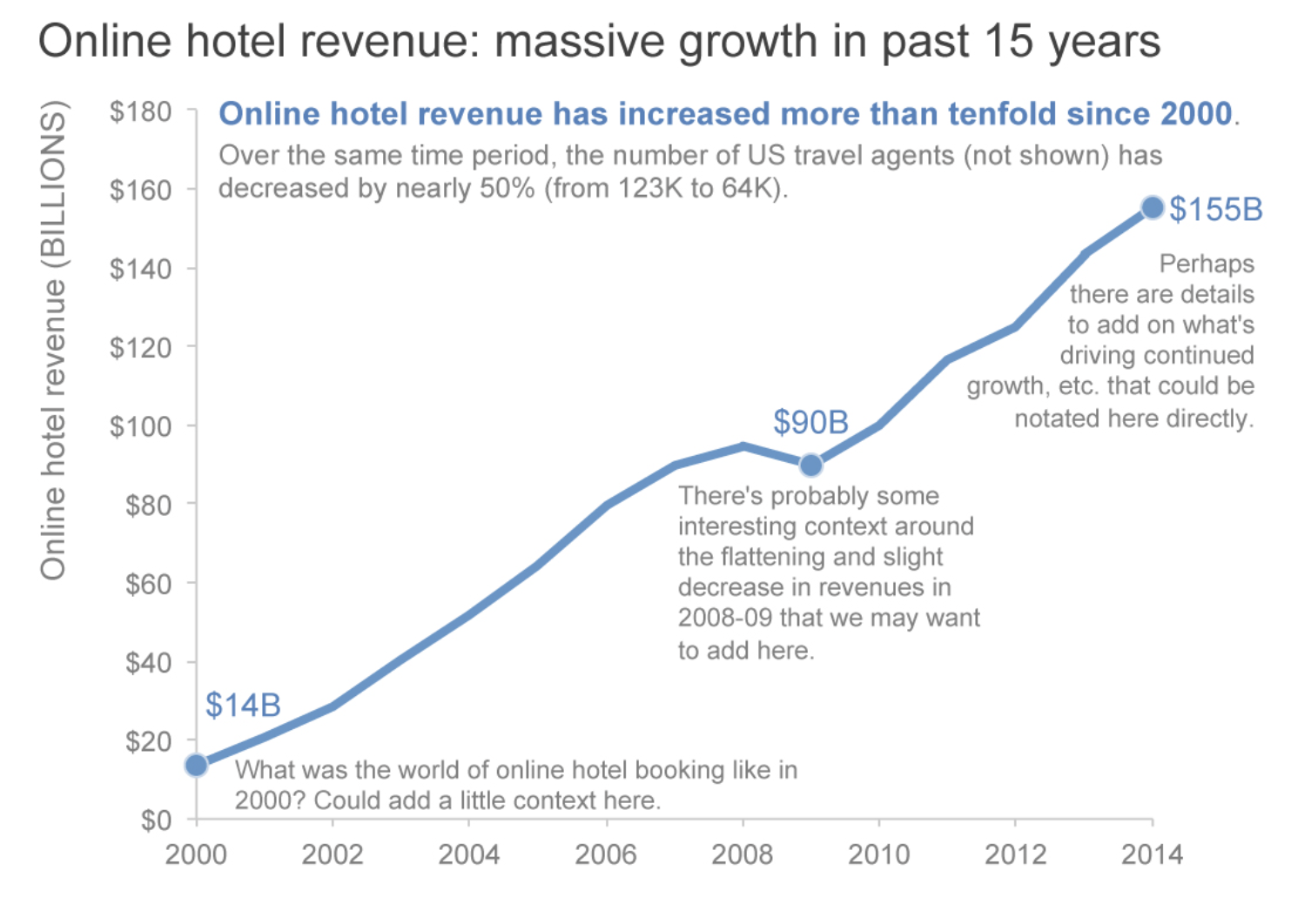
Cole Nussbaumer is the author of Storytelling with Data, a book about turning data into high-impact visual stories. She has a clean, simple style and excels at including helpful annotations without overburdening the graphic. She developed and taught a data visualization class at Google and now offers workshops for companies and the public. Her Twitter feed is full of thoughtful commentary on real-life data visualizations.
Randy Olson @randal_olson
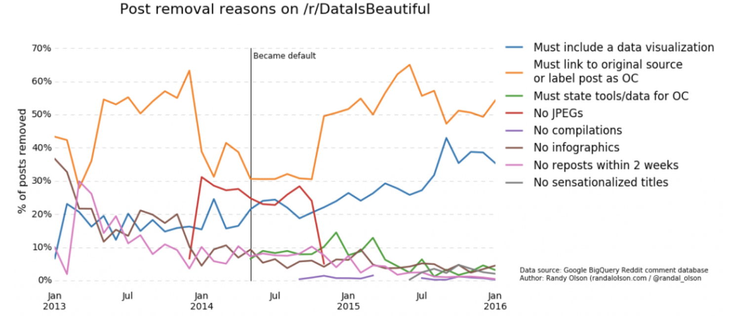
Randy Olson has done extensive work in data visualization and machine learning using Python. He comes out with an original chart on his blog a couple of times a month. And since he's the community leader of the subreddit Data is Beautiful, it shouldn't be surprising that he tweets fascinating visualizations multiple times a day.
Lisa Charlotte Rost @lisacrost
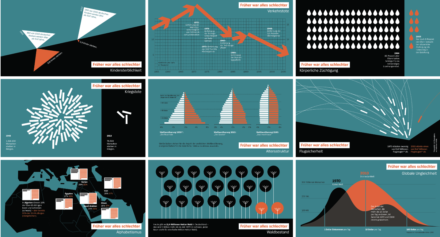
Lisa Charlotte Rost is currently an OpenNews fellow for the NPR Visuals Team. She tweets graphics from the media daily and shares actionable technique tips on her blog once or twice a month:
Your Friendly Guide to Colors in Data Visualisation: A quick overview of why color is important and how to choose the right palette for your visualizations.
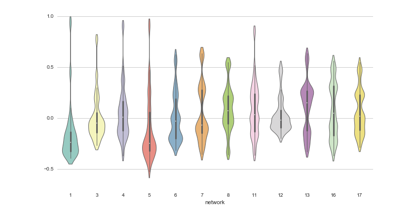
One Chart, Twelve Charting Libraries + One Chart, Twelve Charting Tools: Rost makes the same bubble chart with 24 different visualization tools (including some Python data visualization libraries).
Jon Schwabish @jschwabish
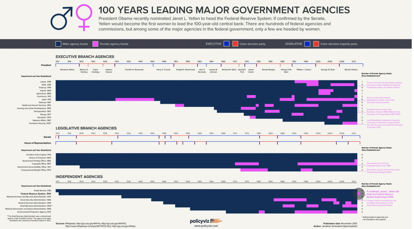
Like Andy Kirk, Jon Schwabish maintains an excellent site of resources for newbies and professionals alike. One section of note is Remakes, where Schwabish takes an existing chart and offers critique by making a new version. But Schwabish might be known best for The PolicyViz Podcast, a series of interviews with practitioners in the field.
Nathan Yau @flowingdata

Nathan Yau does a particularly good job of making public data feel personal and relatable. He usually publishes a new graphic each week, and the topics run the gamut from Americans' eating habits to the ways you're likely to die.
His original visualizations, as well as others he hand-picks from around the web, live on his FlowingData site. Plus, he offers an extensive series of tutorials on visualizing data in R.
Wanna follow them all?
We've included all these experts in one Twitter list. Subscribe here.
Recommended articles
Get our weekly data newsletter
Work-related distractions for data enthusiasts.
