


It's easy to get swept up in the latest design trend. Remember when everyone was into skeuomorphism? Long shadows? All caps cursive with a gradient fill?
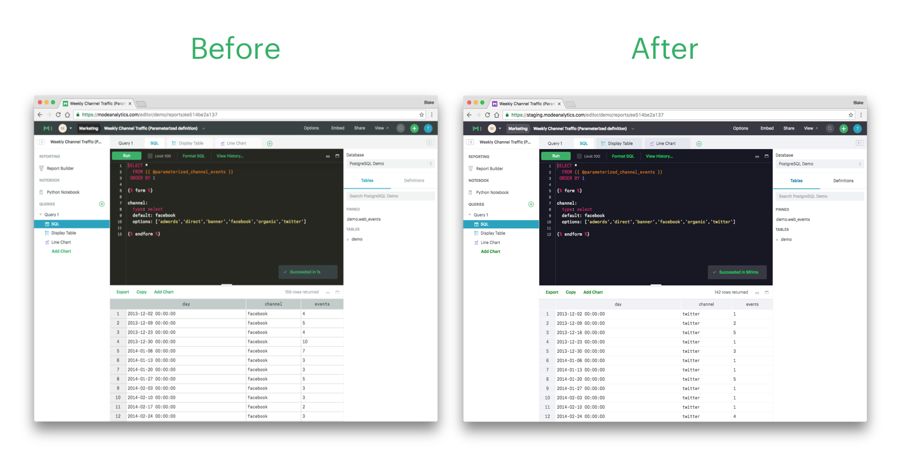
One of the latest trends in web design has been to make text lighter and lighter. While it looks nice, it's pretty hard to read. That's a problem because it makes products less accessible to users.
We should be moving toward more contrast, not less. More contrast means better legibility, especially for folks with low vision, worsening vision, or color blindness.
That's why we made some small, but very important changes to Mode. We updated the gray section of our color palette to include a few new shades. Doing so upped the contrast ratio to meet accessibility standards, without sacrificing the minimalist aesthetic that's come to define Mode.
If you have poor eyesight, please let us know if these changes make a difference! We're always looking for ways to make Mode more accessible to more people; the details matter. Drop us a line at hi@modeanalytics.com
Six down, six to go!
It's been a big week of new features and we've still got six more to roll out. Check back tomorrow to see what we'll cross off our customers' wish lists next!

