


Presenting data effectively is a critical part of communicating insights. Making reports look appealing or building interactive charts isn't simply a vanity project—it's an effective way to ensure key insights resonate with your audience.
The Mode HTML Editor offers the flexibility to use HTML, CSS or javascript to present work any way you want. Whether it's making small tweaks to out-of-the-box charts to stay on brand, or building completely custom visuals from scratch, you have the power to build engagingly beautiful reports powered by refreshable SQL.
Don't just take our word for it—check out some of the recent custom data viz projects analysts have shared with their teams using Mode.
On-brand dashboards...digestible from across the office
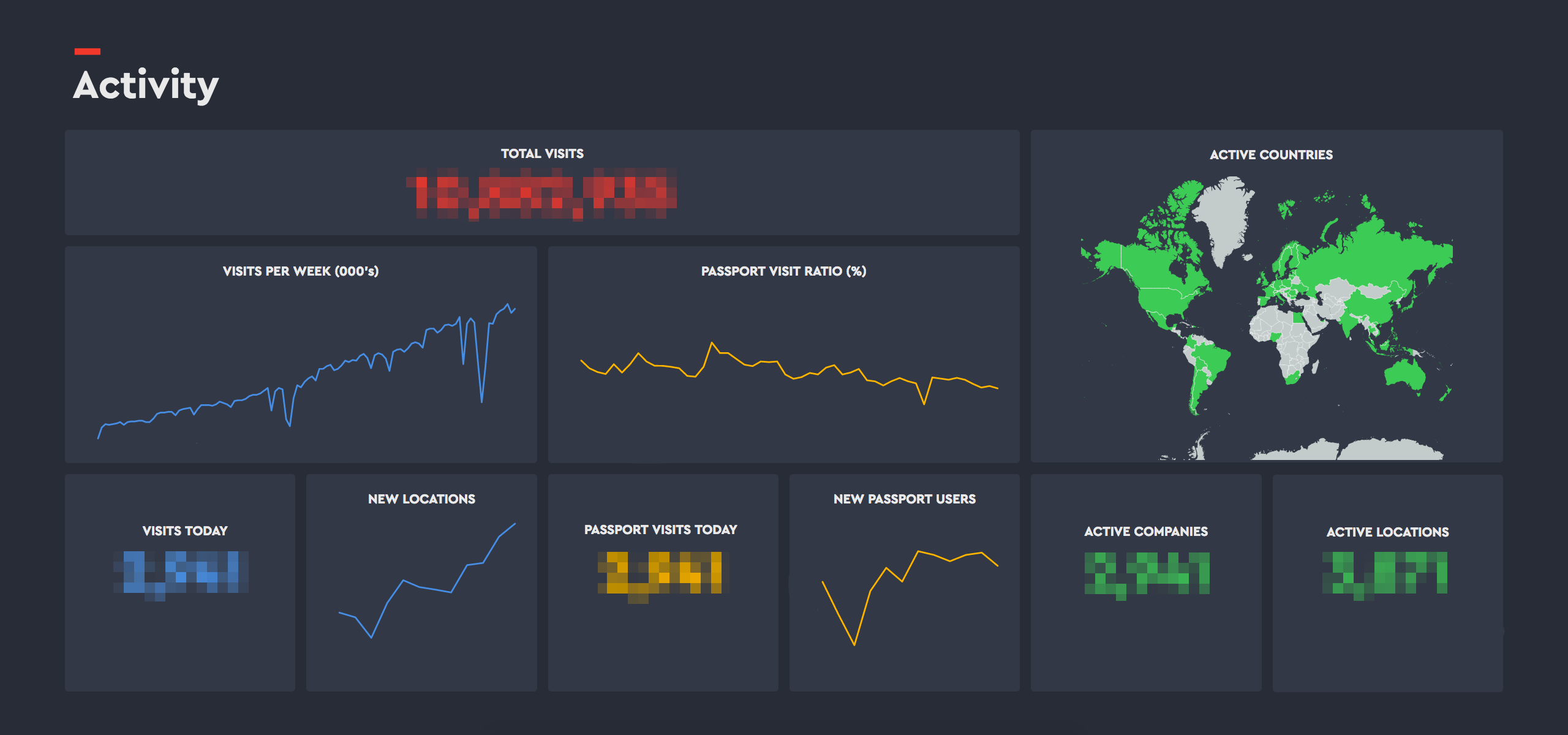
As the modern way to sign-in office visitors, Envoy takes first impressions seriously—they know appearances matter.
After turning their SQL results into charts (or maps, with the help of Mode's example gallery), they apply custom CSS to give their dashboards Envoy's distinct look and feel. Stock fonts and colors are swapped out for their brand styles, and they fit their dashboards to displays positioned throughout their office. The dashboards are easily digestible from a distance, and fit right in with their office aesthetic.
The Thanksgiving rush, visualized
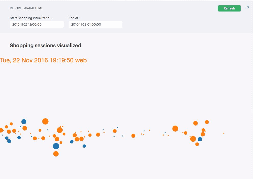
While most retailers are focused on Black Friday, grocers like Good Eggs are focused on the shopping rush that happens before Thanksgiving.
Using javascript to animate how shoppers moved through checkout across both desktop and mobile, Good Egg's data team helps the company understand the rush of customers ordering last-minute items for the big meal.
Plus, by adding form fields using Mode parameters, the report can be easily modified to look at any time frame—without re-writing any code, making this report useful beyond its initial use as a way to understand pre-Thanksgiving shopping trends.
Make KPI's available wherever work gets done
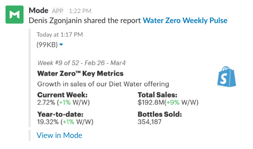
Teams at Shopify need to move fast while staying aligned with the rest of the business. Showing KPI's front and center in Slack ensures everybody is aligned on the high-level goals, and can make data-driven decisions quickly.
With a few small snippets of HTML, Shopify makes sure the right level of detail is always available in their conversations. They can adjust a report preview image to look different than the report itself, making core KPI's available at-a-glance, with links back to the full report for anyone who needs more details.
Maps to optimize maps
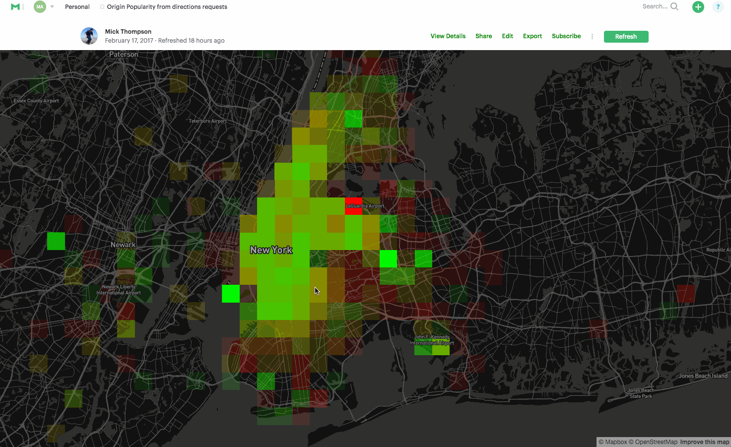
As an open-source platform for custom maps, Mapbox uses a lot of their own mapping libraries, right in Mode. As their data science team worked to optimize the routing API for Mapbox Directions, they combined SQL results with their mapping tools to visualize their progress.
Using an interactive map of travel patterns across New York City, Mapbox looks for neighborhoods to optimize. Brighter green or red areas clearly identify where most folks begin or end trips—immediately highlighting where to focus efforts to refine data, improve instructions, and increase real-time traffic coverage to benefit the largest number of customers.
Understanding networks across any market
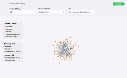
Thumbtack connects customers to professionals, ensuring projects get done quickly, no matter the market.
By combining Mode report parameters and D3, Thumbtack's data team built an interactive data tool that teams through out the company use to visualize the dynamics of their marketplace.
Anyone at Thumbtack can quickly look up any category in any market—like balloon artists in San Francisco—and use the network visualization to explore how customers' requests are getting matched with quotes from professionals.
More resources for customizing your visualizations
In San Francisco and want to meet other analysts interested in custom data visuals? Sign up to join us on Tuesday, March 28 as we explore how analysts at Thumbtack, Good Eggs, and Envoy are using D3 and other data visualization techniques to communicate with their teams.
In the meantime, check out some of these handy resources for making sure your reports look good and command your teammates' attention.

