


When we launched Mode's new SQL workflow earlier this year, we said there would be a lot to come on the charting front. Today the first set of new charting features hits the editor to help you find and deliver answers even faster.
Pivot Charts can help you explore data visually, earlier in your analytical process, and with simpler queries. Rather than exporting a large data set to Excel for pivoting and charting, you can now aggregate data right in Mode.
Let's say we want to start exploring how app logins vary by device and country. In the past, this was a pretty difficult chart to make in Mode. It not only involved lots of tedious CASE statements, but also required you to know all of the values ahead of time.
Now, you can skip the hassle and write a simple query (this example uses fake data from a SQL School case study):
SELECT DATE_TRUNC ('day', ye.occurred_at) AS day
     , ye.location
     , ye.device
     , COUNT(yu.user_id) AS users
  FROM tutorial.yammer_events ye
  JOIN tutorial.yammer_users yu
    ON yu.user_id = ye.user_id
 WHERE yu.state = 'active'
   AND ye.occurred_at > '2014-05-01'
   AND ye.occurred_at < '2014-05-08'
   AND ye.event_name = 'login'
 GROUP BY 1,2,3
When you open the chart tool, the new “Chart Data” section allows you to quickly aggregate your data. In this example, Mode automatically aggregates and displays the values for each date.
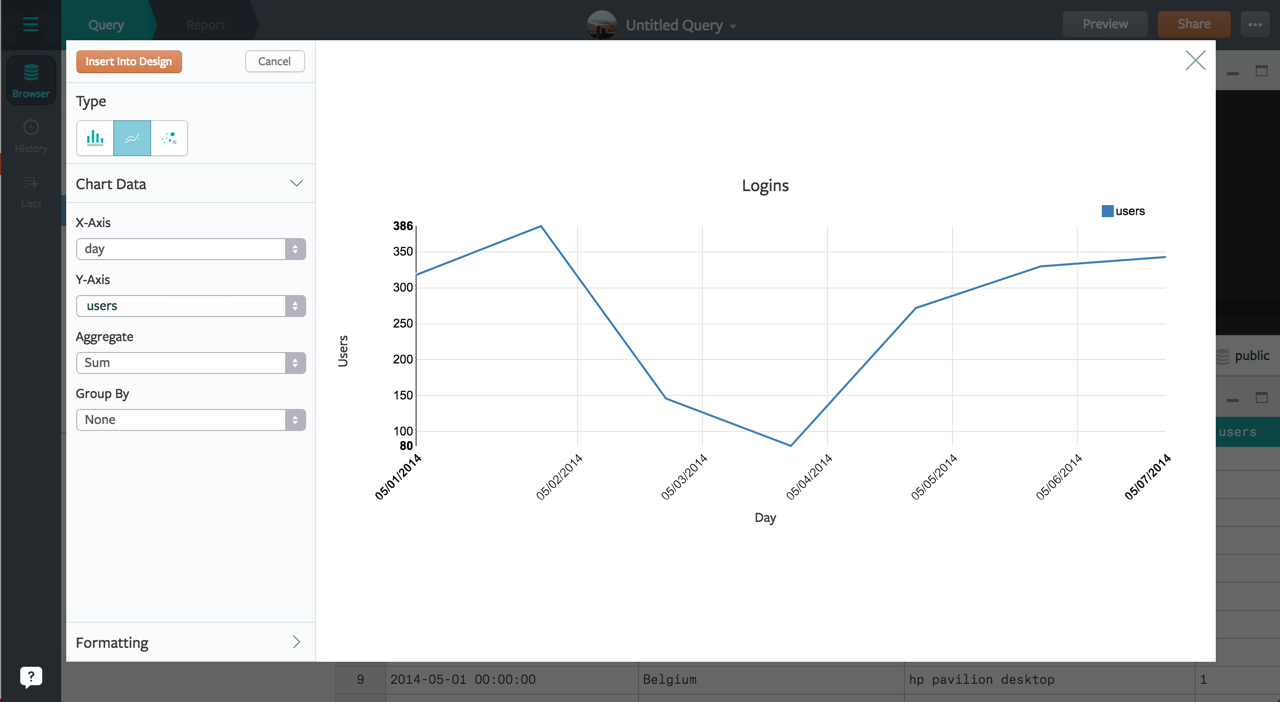
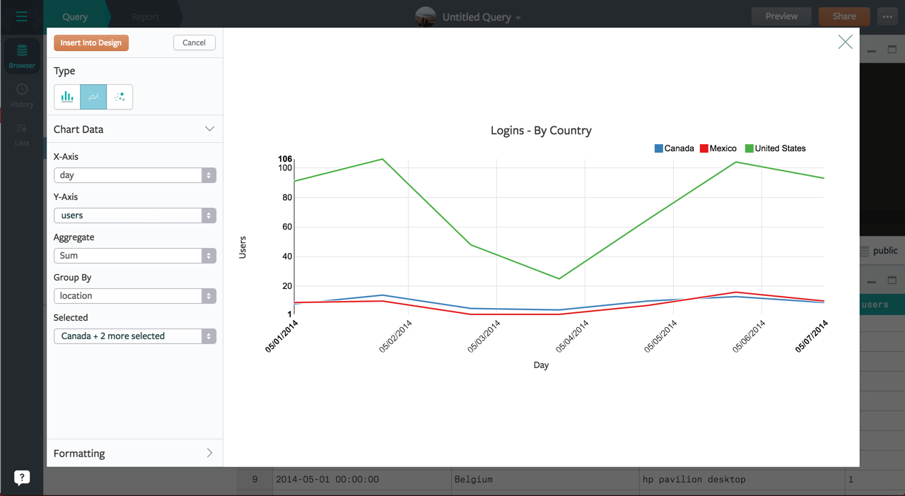
Use the “Aggregate” drop-down menu to perform calculations (Count, Average, Sum, etc). And since the dataset includes information about countries and devices, you can quickly display each country as its own series using the “Group By” drop-down menu.
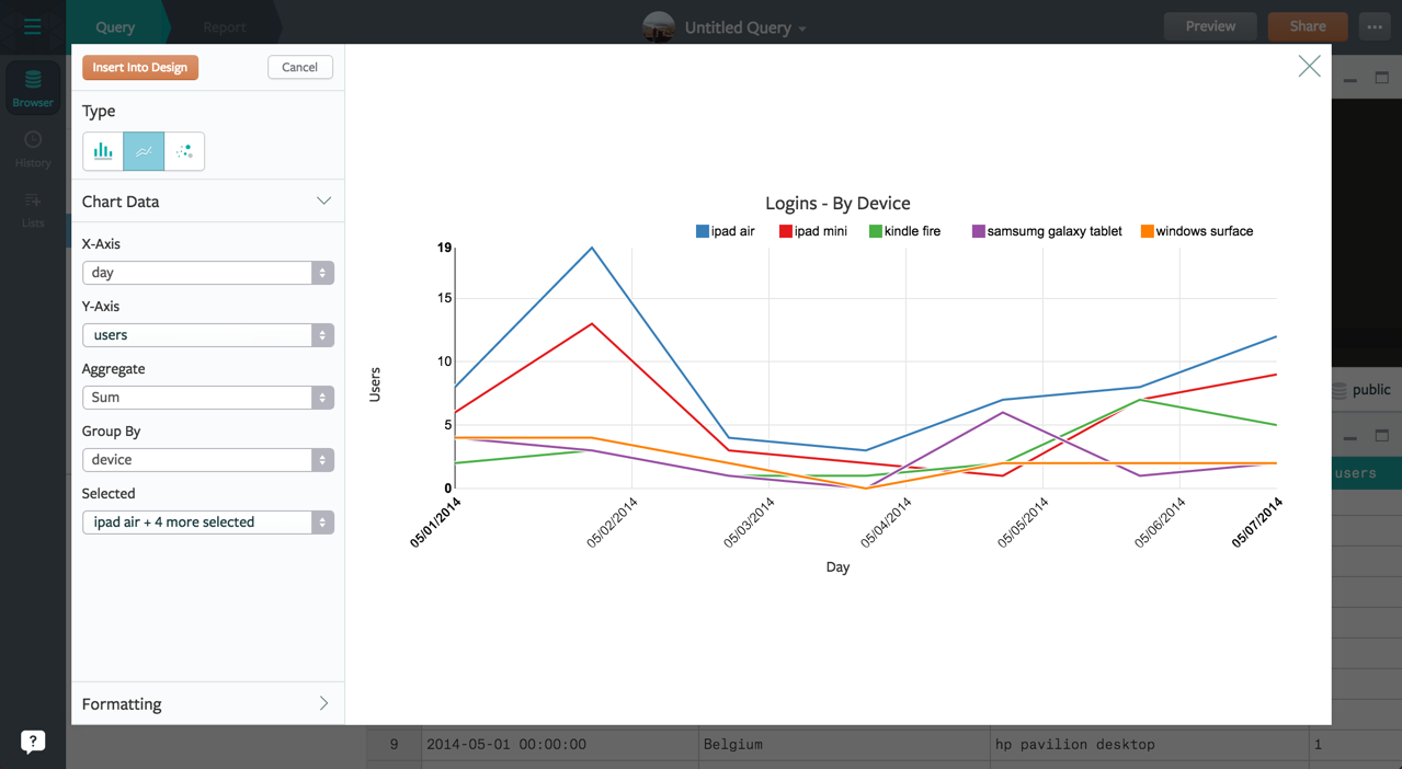
In the past, looking at the same data by device would require yet another long, difficult SQL query. Now, it takes just one click to change the “Group By” selection:
After aggregating the data as needed, click “Insert Into Design” and share the report.
To play around with Pivot Charts using this data set, simply open the report in a new tab and clone it!
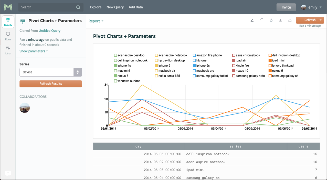
Turning Pivot Charts into Data Tools
Last week we discussed how parameters can help analysts turn commonly requested queries into data tools. Keep parameters in mind as you start to explore Pivot Charts. You can combine these two features to help other folks explore data on their own.
Instead of writing the SELECT statement with both device and location as we did above:
SELECT DATE_TRUNC ('day', ye.occurred_at) AS day
     , ye.location
     , ye.device
     , COUNT(yu.user_id) AS users
We can replace the location and device lines with a parameter:
SELECT DATE_TRUNC ('day', ye.occurred_at) AS day
     , ye.{{series}} AS series
     , COUNT(yu.user_id) AS users
And add the parameter details below the query:
{% form %}

series:
  type: select
  default: location
  options: [[location,location],
            [device,device]]

{% endform %}
Then select the series column as the “Group By” in the chart tool.
When the viewer lands on the report, they can choose location or device and refresh the report to change the chart. Click through to the report to explore the parameterized SQL query.
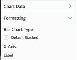
A Quick Note About Stacked Bar Charts
Many of you have told us you'd like to keep stacked bar charts stacked. Now you can. You'll find the setting under “Formatting” in the chart tool.
More Charts On The Way!
Now with more powerful charting tools in your hands, we're working to add more chart types. Stay tuned!
Drop us an email or Intercom message if you have questions or feedback about these new charting features (or anything else you'd like to see us tackle). We love hearing from you.

